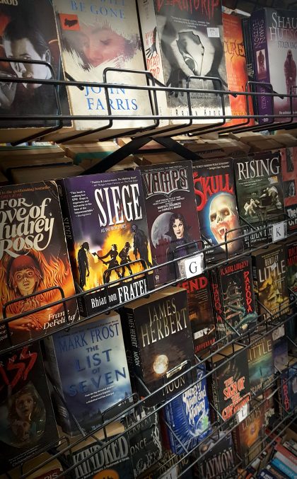
As a horror author, I think about the cover of horror novels often. Maybe too often. Those in the know, know that I curate the new releases at the Horror Writers Association website. That’s one way that I see a lot of horror novel book covers every single month.

As a teen, and today, I peruse the stacks of used bookstores like the proverbial kid in a candy store. It’s always been my favourite thing – the biggest hit to that wanting-seeking horror-loving drive deep within me – going through all of that eerie eye candy. I can think of no better way to phrase it, so I use that term specifically when posting to the HWA wall of wonders every month. The best part of the covers on the new releases page is they are the best of both worlds; the new style and old. Bold text on a solid background or the tried and true photo of a dimly-lit abandoned house in a forest. Preferable with a bold serif font and gradient fade to black on the bottom.
I also think of horror novel covers when designing my own. I’ve done the covers of two Nightface reprints, I’m designing the new cover for Nightface: The Elders, and I’ve done the covers for all Pray Lied Eve.
That’s really the point of entry; the book cover. I see fantastic representations of covers used to their fullest and most addictive potential on Instagram every single day. A lot of the booktubers that I follow post the most delicious covers and have fun with it; like Mers from Harpies in the Trees and Alex from Hey Little Thrifter; countless bookstagrammers and book bloggers like Jenna from bookmarkyourthoughts; the bookstores that I follow like Allison the Bookman where this photo was taken or Black Squirrel Books here in Ottawa. taking that run-on sentence to say there are a lot of places where the covers are not only the sell-point but that addiction point–that first hit you get for free. Or that scent you catch on the air that makes you salivate in a way, recalling a hot tea and your favourite reading nook perhaps.
Walking through a new bookstore is a whole different world of flashy bright images. As a good friend, Chris Carroll at Perfect Books of Ottawa, had recently pointed out that some book designers ought to try harder and keep covers from looking so very alike when one smartly arranged cover sells well. You get to see the new trends in book cover design. Maybe that’s lost on the casual consumer but it certainly not lost when you pick up something, croon “Ooooh, look at that…” when you’re not interested in the genre, you’re not particularly drawn to the title, and you have no idea who the author is! You are responding only to that umami of image, colour, and typography.
And this is why it’s all been on my mind as an author plus book cover designer.
There’s this tension between what you like, what you know that works, and what you need to design. There is a dilemma right now. Do I put the author name at the very top and bold like I’ve been taught to or do I put the book title up at the top in bold like I prefer or do I lead with a striking image? Do I use the picture of a haunted house? Do I lead with a picture of a haunted house in the moonlight reflecting off snowy trees? Does that not remind you of 700 other books? Is it a bad thing that it reminds you of 700 other books?
There’s a reason that we find such glee in a tome like Paperbacks from Hell or a series like Cameron Chaney’s Library Macabre it’s those covers; eerie eye candy that grabs us and all I can hope is that while I’m designing the covers for the upcoming Nightface, Pray Lied Eve III and as yet untitled novel that I’m working on that I can only hope one enters those ranks of the books that spark joy and me as I walk down the aisle of a used bookstore or the end-up gracing the hallowed ranks in the internet’s hall of mirrors that is Instagram, Tumblr, and Pinterest; or in the horror journals of record that are books like Paperbacks from Hell. Just some food for thought as I flip through countless images that I’ve already seen grace the covers of other really good horror books or not so good horror books and fight the urge to download yet another photo of a dimly-lit abandoned house in a forest.
Allison the Bookman
Black Squirrel Books
Perfect Books
Bookmark Your Thoughts
Harpies in the Trees
Hey Little Thrifter
Library Macabre